The Evolution of Automotive Identity: Why Brand Names are Replacing Traditional Emblems on Modern Vehicles

For decades, the automotive industry relied on a minimalist visual shorthand to command presence on the road. A chrome badge—whether the storied three-pointed star of Mercedes-Benz, the prancing horse of Ferrari, or the simple blue oval of Ford—was sufficient to identify a vehicle instantly. These static icons served as the singular anchor of brand identity, functioning as a silent ambassador for prestige, performance, or utility. However, a significant aesthetic shift is currently sweeping through global design studios: the transition from iconic symbols to full-text, spaced-out lettering. This trend is not merely a superficial stylistic update; it represents a fundamental change in how manufacturers approach vehicle architecture, digital branding, and international market recognition.
A Departure from Tradition: The Shift to Text-Based Branding
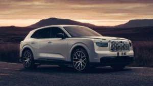
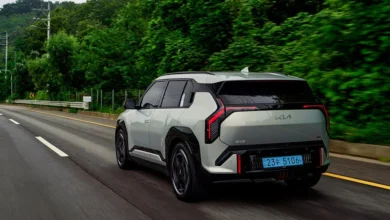
The adoption of full-brand lettering as a primary identifier is increasingly replacing the traditional hood-mounted or trunk-centered emblem. This design philosophy, exemplified by the latest generation of European models like the Skoda Elroq, integrates the brand name directly into the vehicle’s "Modern Solid" design language. By spelling out the name in wide, individual letters, designers are moving away from the isolated, "stuck-on" badge aesthetic.
This shift is driven by the necessity for modern vehicles to appear more cohesive. In the past, a badge was an additive element—an afterthought bolted onto a finished surface. Today, typography is treated as a structural component. When a designer places a brand name across the rear of a liftgate, it is precisely aligned with the horizontal axis of the taillights or the vehicle’s shoulder line. This creates a visual rhythm that balances the rear fascia, serving as a graphic anchor that is as intentional as a light bar or a character line in the sheet metal.
Historical Context and the Evolution of Typography
While the current trend feels like a modern innovation, the practice of spelling out a name is rooted in historical automotive design. Porsche, for instance, has long utilized the prominent "PORSCHE" script across the rear decklid of its 911 series, turning the brand name into a high-end design feature rather than just a manufacturer identifier. Similarly, Volvo has historically favored word-based branding to emphasize its reputation for clarity and Scandinavian minimalism.
The difference in the contemporary landscape lies in the ubiquity of the trend across all price points and vehicle segments. Historically, lettering was often reserved for luxury vehicles or specific performance trims. Today, it is a universal strategy applied to everything from budget-friendly hatchbacks to premium electric SUVs.
This evolution can be categorized into three distinct phases:
- The Iconic Era (1950s–1990s): The dominance of the singular emblem. Brand identity was tied to a unique shape or silhouette.
- The Hybrid Era (2000s–2015): The introduction of secondary, smaller text identifiers alongside traditional badges to signify model names and trim levels.
- The Typographic Era (2016–Present): The integration of the brand name as a primary design element, often replacing the emblem entirely or relegating it to a secondary, smaller position.
Design Implications: Typography as Architecture
The integration of text into the vehicle’s "anatomy" is a sophisticated process that requires close collaboration between graphic designers and mechanical engineers. Unlike a traditional badge, which is typically a molded piece of plastic or metal, the lettering used today is often custom-designed to match the brand’s digital and print visual identity.
Brands like Peugeot have taken this concept to its logical extreme by incorporating the name into the vehicle’s lighting architecture. By illuminating the brand name within a rear light bar, the manufacturer ensures that the identity of the car is visible at night, effectively turning the name into a glowing signature. This serves both a functional and a marketing purpose: it reinforces the brand in the digital age, where social media photography often involves night-time shots of glowing light signatures.
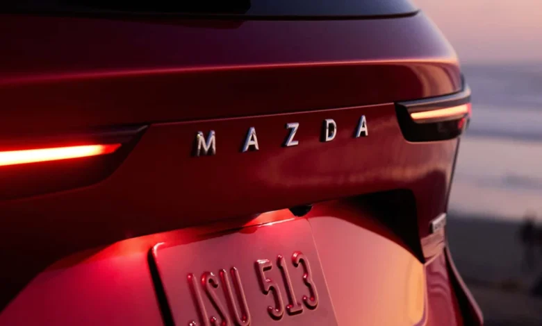
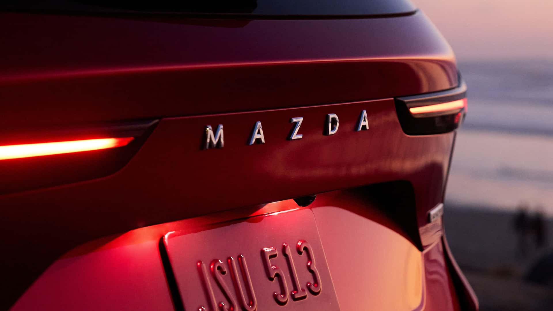
Mazda, conversely, has opted for a clean, sophisticated approach, using refined, minimalist typography that emphasizes the premium nature of its current CX-lineup. By reducing the visual noise on the rear of the vehicle, the manufacturer forces the observer to focus on the shape of the sheet metal itself, creating an image of confidence and restraint.
Global Market Dynamics and Recognition
The rise of the written name also addresses the practical challenges of a globalized automotive market. As competition intensifies, particularly with the influx of new manufacturers from Asia, the ability to ensure that a brand is immediately recognizable—regardless of language or geography—has become critical.
An emblem requires the viewer to already possess knowledge of the brand’s history to correctly identify it. A name, however, is universally accessible. It removes the barrier to entry for potential customers in new markets who may not be familiar with a manufacturer’s stylized logo. By spelling out the name, the manufacturer ensures that the brand equity is transferred directly to the consumer, regardless of whether they have seen the logo previously.
The Role of Digital Branding
The shift is also heavily influenced by the transition toward digital-first communication. Automotive marketing has moved from static print advertisements to mobile-first social media campaigns. In a digital environment, the brand name is the most effective way to communicate identity. Algorithms on social media platforms often prioritize clarity, and a brand name is easier to index, tag, and recognize than an abstract emblem.
Design studios are now creating "digital-native" typefaces for their vehicles. These fonts are designed to remain legible at small scales—such as on a smartphone screen—while maintaining their impact when blown up to full size on the rear of an SUV. This consistency across digital, print, and physical vehicle applications creates a unified brand ecosystem that is essential for modern marketing.
Will Traditional Badges Become Obsolete?
Despite the dominance of this trend, industry analysts believe it is unlikely that the traditional emblem will disappear entirely. The badge remains the most potent symbol of a company’s heritage and history. For many legacy automakers, the logo is an emotional asset that cannot be replaced by a simple word.
Instead, we are seeing a "dual-identity" strategy emerging. Many manufacturers are retaining their traditional logo on the front hood, where it serves as a historic seal of quality, while using the full name on the rear to serve as a modern design element. This allows brands to bridge the gap between their storied past and their tech-forward future.
Broader Implications and Future Outlook
The trend of using full-name lettering is a symptom of a broader movement toward "clean" design. As vehicles become more aerodynamic to accommodate electric powertrains, designers are removing clutter, such as excessive vents, sharp angles, and protruding ornaments. In this simplified environment, a long, elegant string of letters acts as a focal point, providing a sense of horizontal width that makes the car look planted and stable on the road.
As we look toward the next decade of automotive design, we can expect this typographic focus to evolve further. We may see the integration of haptic or interactive elements within the lettering itself, or even more aggressive use of lighting technology to make the brand name a dynamic, rather than static, feature of the car.
Ultimately, the shift from symbol to word is a reflection of the industry’s need for clarity in a crowded marketplace. By turning their names into design features, automakers are not just labeling their products—they are defining them. As every surface, line, and detail of a vehicle is scrutinized to ensure it adds value to the user experience, the humble brand name has finally claimed its place as an essential component of automotive architecture. Whether viewed from the perspective of design, marketing, or engineering, the message is clear: in the modern automotive era, the name is the identity.